Information Resources
Above the Fold
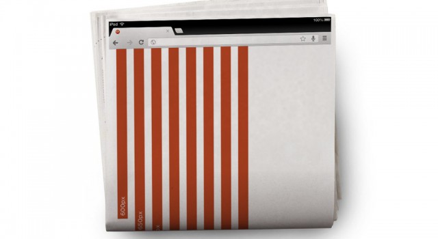
When creating mechanicals for website strategy, or Strategic UI/UX, we often make recommendations for content that should be visible above the fold. In the context of Web search/usage, the term above the fold refers to the part of the web page a user can see without having to scroll down or use the scroll bar within their web browser. In general, this space is at the top of a Web page, and is considered prime real estate for visibility and getting information seen most efficiently. The term, itself, is derived from the web’s ephemeral predecessor, the newspaper, in which the most poignant stories—the ones that would be more likely to sell that particular newspaper over competing papers—were those that were above the crease on Broadsheet or Berliner sized papers. Web strategists use the term above the scroll interchangeably with above the fold.
As browser resolutions increase, the fold mark keeps changing. In 2013, 25.4% of the world was browsing at 1366×768, as opposed to only 18.7% in 2012. And the growing availability of mobile phones and tablet devices, such as iPads, has changed the landscape to a point where we can no longer rely on a majority resolution and location of the fold. As a result, we recommend fluid, responsive layouts that accommodate for the broadest range of resolutions possible. Not only does this help clients to be able to see the most important content, while helping them to sell their services over their competitors’, but it also helps us to reorganize and strategize content based on the different types of users. For instance, a user on a phone may be more interested in contact information, a tablet user may want to read topical news or view videos, and a desktop user may want more in-depth articles and research information. Responsive layouts help gear the content toward these different demographics and re-organize what’s seen above the various folds.
That said, we’re currently in the age of Cinema (16 x 9 resolutions) and Retina (2x Device Pixel Ratios) displays. With iOS’s dock protruding into the available horizontal space and retina’s ability to scale content by pinching, the confusion over the floating fold mark is mired further.
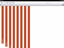
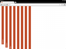
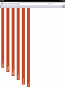
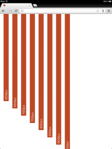
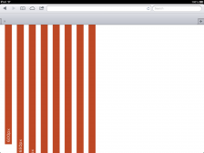
With the one caveat that the rapidly changing environment may soon render this outdated, our recommended fold mark remains 645px for landscape orientations (with allowance for a persistent bookmarks bar) and 900px for portrait.
Examples of our testing can be seen below:
If you’re interested in learning more about fold lines, Strategic UI/UX or the changing landscape of the web, drop us a line to initiate a conversation.
Permalink: https://www.era404.com/info/above-the-fold/


