Press Releases
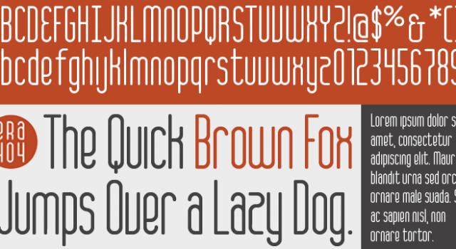
ERA404 Regular Typeface
ERA404 is pleased to announce the release of our new typeface, ERA404Regular. The font was designed around our new logo and branding campaign, as a response to requests from designers and artisans within our network and our clients. It is now available for download on MyFonts in opentype format (Mac and PC).
About the Typeface
The new typeface complements the shape and strength of the graphic elements incorporated into ERA404′s new identity system. Each of the six disciplinary icons, which can be seen on the rebranding press release page as well as throughout the www.era404.com site, each begin with a circle. This shape, which symbolizes strength, is also meant to imply the genesis of the idea at the center of all work we do. As each icon “grows,” the idea begins to take shape. In all of our disciplines—print, identity, digital, motion and environmental design, as well as development and strategy—the idea remains our central focus toward growing new pieces. This concept is quite literally depicted in our disciplinary icons.
Continuing with this concept, the main logo for ERA404 was also redesigned to be encapsulated in the circle, effectively portraying the studio as an “ideas company.” The typeface was designed as an amalgamation of the rectalinear disciplinary icons and the circular, central focus. This gives ERA404 a nice balance between the rigidity of many condensed sans-serif faces and the graceful arcs traditionally seen in script or serif fonts. Recommended primary usage is for headlines and signage, however it may also work for body copy in some applications.
Licensing and Usage
The font, designed by ERA404 Creative Director, Don Citarella, is available through MyFonts.com and subject to their licensing, warranties, limited liabilities and EULA. For more information on how ERA404 Regular may be implemented into your design work and signage, please contact ERA404, here.
Recommended Links
Permalink: https://www.era404.com/press/font/


